You can learn a whole lot from ads that miss their creative mark

I have a huge collection of bad ads.

Knowing what not to do is a killer way to learn what to do. Here are three of my favorites. They’re fantastic examples of mistakes agencies and clients make again and again. If you’re putting together your portfolio, you have an obligation to yourself to not make a single one of these. And if you’re at an agency, kick and scream and shake the room to avoid doing this kind of stuff. It doesn’t serve your client well. And it won’t get you your next job.


intel-man-at-pool-ad

I love this Toshiba ad because it’s telling me who I am: Innovative, versatile, a visionary, intelligent! Wow, good for me! And wait, what a quick trick: They’re also talking about the laptop! How clever! It’s all capped off with a classic generic photo of white male ‘success’ that’s the opposite of innovative. Look how relaxed and confident he is! And did I mention versatile? Their tag is ‘leading innovation’ and this is the best they could do? It’s just a laptop. And you’re not so innovative.


hitachi-super-hero-low1

I love this Hitachi ad! It has no idea what it wants to be! It’s got two taglines — ‘Inspire the Next’ and ‘It’s Our Future’, plus it’s part of some larger ‘social innovation’ campaign indicated in small type above ‘It’s Our Future’, and is also the URL of the website they hope people will flock to. What is it they want to tell us? No clue. Commit to one idea and say it brilliantly. The headline adds to the ‘what the?’ Why are they talking to an investor for a pension fund or a hedge fund manager as if they’re five? And while we’re at it, why is the headline in quotes? Who is it that’s talking down to us?!


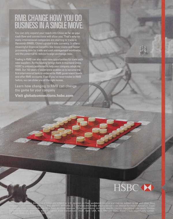
hsbc-chess-board-low

This HSBC ad is classically bad because it’s really an all type ad — headline says it — with a generic photo of a chess board in the park slapped on, loosely tied together by the useless phrase ‘in a single move’. And why’s it in a park vs. a ritzy private club? Isn’t the park where people without jobs hang out while everyone else is working?


Quick Summary


  1. Say one thing. That’s about all I can remember.
  2. It’s okay to ask a question, but make it compelling — makes me think or rethink something.
  3. If you use generic photos, your ad will be too. Always.
  4. Don’t show me what your headline’s saying, show me something that makes me ‘get’ the headline or vice versa.
  5. Don’t tell me, show me. Saying you’re ‘innovative’ in an ad will almost always make you not.
  6. And don’t tell me who I am. I already have a pretty good idea.


These are print ads, but it’s easy to find the exact same poor thinking on TV and in brand experience spectacles that do something really cool and tie it back to the brand or product in some painfully weak way.

Take a personal oath to never be forced into making these mistakes. Put up a fight. It’s your duty. These kinds of ads are a waste of a client and agency’s time and money. And for you, doing ads like these will only get you a job that’s equally inspiring.

Got a great bad ad? Send it to me. I’d love to share it!

All Posts